Everything you need to know about display:flexbox


Flexbox is a display property value that is useful to design layout structures easily. It helps us to control the size, position, and spacing of elements relative to their parent and each other. They work great for responsive design.
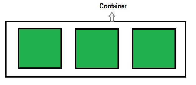
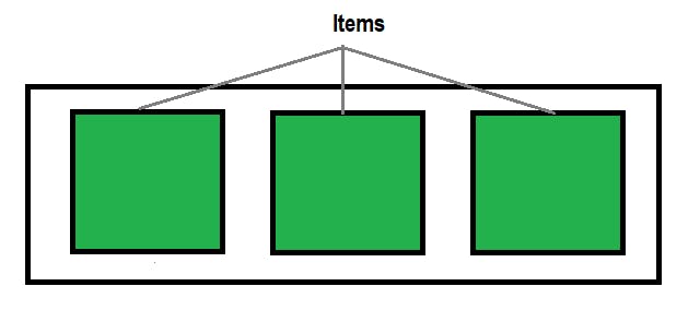
Flex has its own set of properties that works in the parent-child relationship.
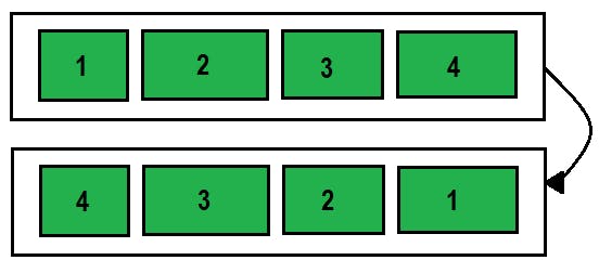
- Flex-direction
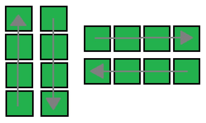
.container{
    flex-direction: column-reverse | column | row | row-reverse;
}
- Justify-content:
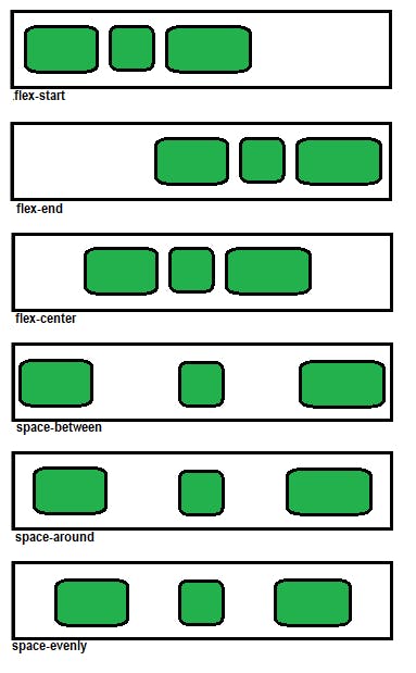
.container{
    justify-content: flex-start | flex-end | flex-center | space-between | space-around | space-evenly;
}
- Align-items:
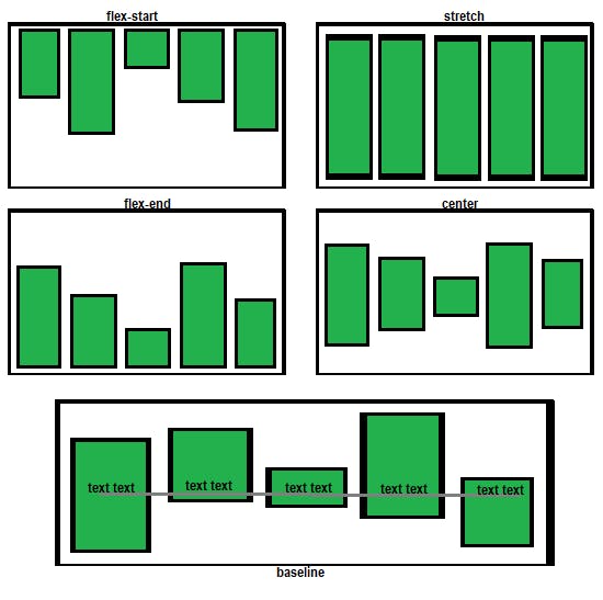
.container{
    align-items: flex-start | flex-end | center | stretch | baseline;
}
- flex-wrap
.container{
    flex-wrap: wrap | wrap-reverse | no-wrap
}